Calum Webb
Sociologist.
Intersections of Inequality using MOG: the Mapping Overlaps Gadget
Some time ago I saw a map that was created by Timo Grossenbacher and Angelo Zehr making the rounds on Twitter. This map showed the overlap between income tertiles and inequality tertiles in Swiss municipalities. Income was plotted using a blue scale and inequality was plotted using a red scale. Both variables were broken down into tertiles (low levels of income inequality, middle levels, and high levels) based on them having equal numbers of municipalities in them. This meant that there was 9 possible combinations of colours: high income, high inequality; low income, high inequality, et cetera.
This kind of descriptive mapping showed some really interesting things - areas of Switzerland that had high inequality and high average incomes contrasted with others those with high incomes but low inequality. It was a way of getting at something that I had tried to encourage people to do with the CWIP App, comparing univariate maps side by side to find clusters. But now it was so much easier because the overlap made it explicit.
I also happened to be working on a piece of research at the time looking at the spatial distribution of Child Welfare Interventions. I couldn’t quite get my head around the spatial parameters in the spatial regression models I had built, I needed to see what was going on to really understand. Luckily for me, Timo Grossenbacher and Angelo Zehr had made their code open and wrote a tutorial blogpost on how to replicate their beautiful map.
So, I took their code as a template and it worked beautifully. However, I noticed something that always happens when I do a project: I was writing out and ‘find and replacing’ the same lines of code multiple times to look at different local authorities, or at different combinations of variables. I remember reading something someone said one time “if you have to write the same piece of code more than 6 times, make it into a function”. So I turned it into a function.
Then I realised that this would be something that many people might be interested in, particularly the social workers and community activists I’ve met up and down the country, so I decided to make it into a responsive Shiny app. I had a small combined dataset with 104 different variables, which could lead to 5304 unique combinations (I think), and that’s without thinking about comparing different local authorities. I wasn’t going to get through them on my own, let alone write about them. I also needed a template to update the CWIP App maps anyway, so why not create a tool many people could use. And so, the Mapping Overlaps Gadget, or MOG, was born. In this blog post I’m going to focus on how to use the MOG, I might write something about the code at a later date.
What data does the MOG include?
At the moment, the MOG contains LSOA level data from the following sources:
- Data from the Indices of Multiple Deprivation 2019
- Data from the 2011 Census relating to Ethnicity
- Life Expectancy at Birth (2009-2013)
- Median House Price (2017 & 2018)
- Journey Time Statistics for Key Services (2017)
- Access to Healthy Assets and Hazards (AHAH) 2017
You can access the MOG by going to https://webb.shinyapps.io/MappingOverlayGadget/. It takes a little time for MOG to boot up, so please be patient. It also takes a little time for it to generate a plot from your request, especially if you are looking at a large or multiple local authorities. You can access univariate (single variable) maps and overlap maps by using the navigation pane on the left hand side.
The MOG is completely free to use and uses open data. The web hosting is paid for by the University of Sheffield’s Higher Education Impact Funding - if you would like to see the MOG stay online, any feedback you can email to me would be greatly appreciated, so I can make the case for hosting costs for next year. I don’t get as much feedback on impact as I need, so any you can spare is greatly appreciated. Anyway, I have been cap in hand long enough…
An example of using MOG for neighbourhood insight: Income deprivation and travel time to employment centres with the most jobs…
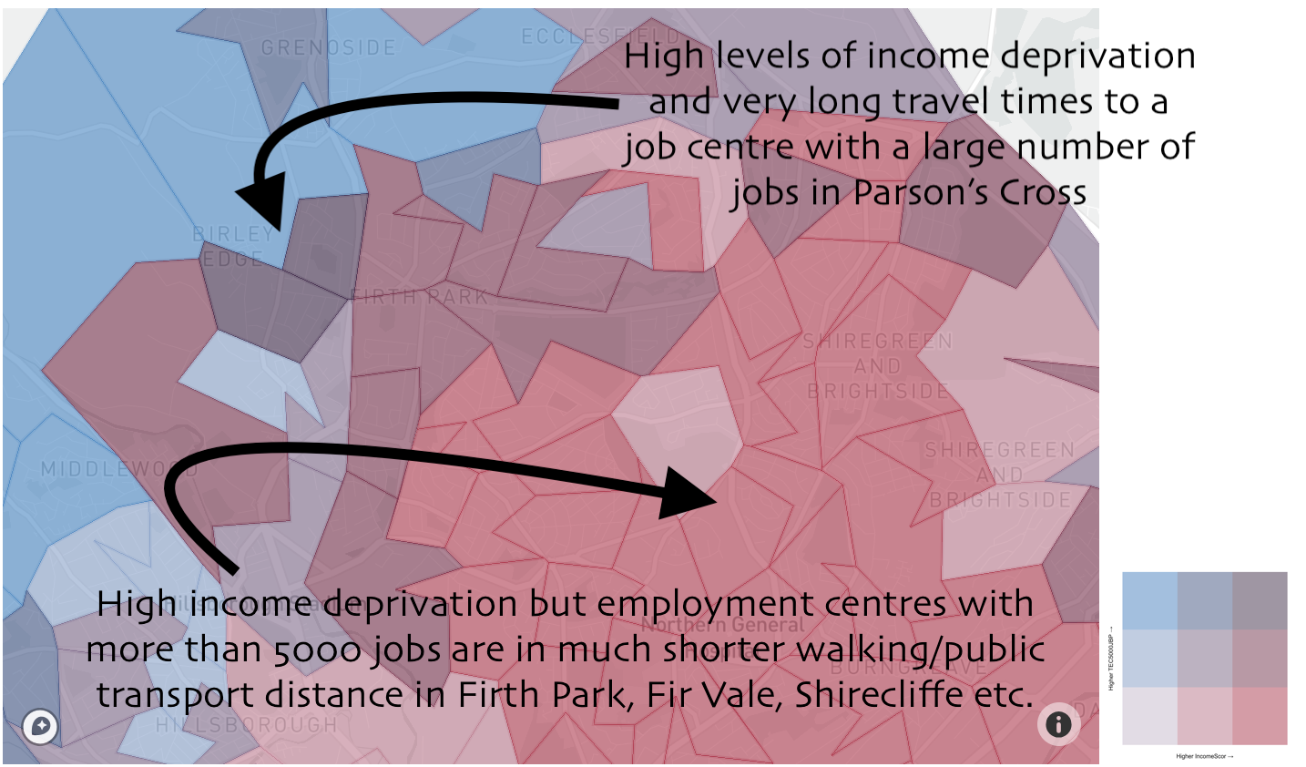
Above this text is a map of Sheffield. Each of the shapes that are overlaying the map is a Lower Super Output Area (LSOA). Each LSOA has between 1,000 and 3,000 people living in it. On the blue scale with have the travel time by public transport or walking to the nearest employment centre with over 5000 jobs, on the red scale we have the level of income deprivation in the neighbourhood (the proportion of people in income-related welfare benefits and/or whose income falls below 60 per cent of the median national income). First, let’s look at the ranges in each group…

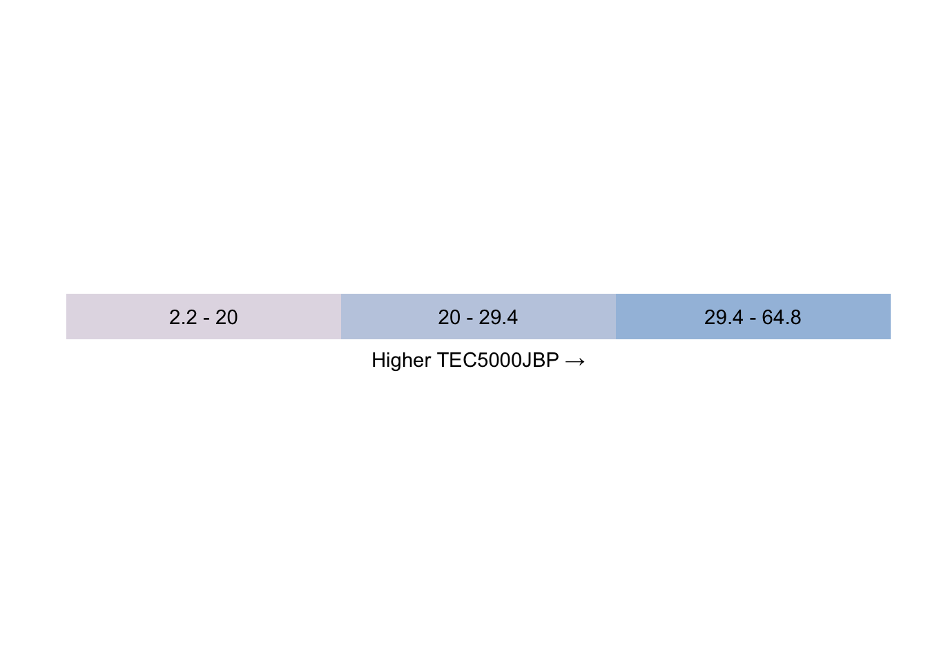
Here we can see that a neighbourhood being coloured in grey on the TEC5000JBP (travel time in minutes by public transport to the nearest job centre with 5000+ jobs) means that the average travel time for that neighbourhood is between 2.2 minutes and 20 minutes. In the next most extreme value, the pale blue, it is between 20 and 29 and a half minutes. In the most extreme third of neighbourhoods, the richer blue, the travel time is between 29.4 and 64.8 minutes.

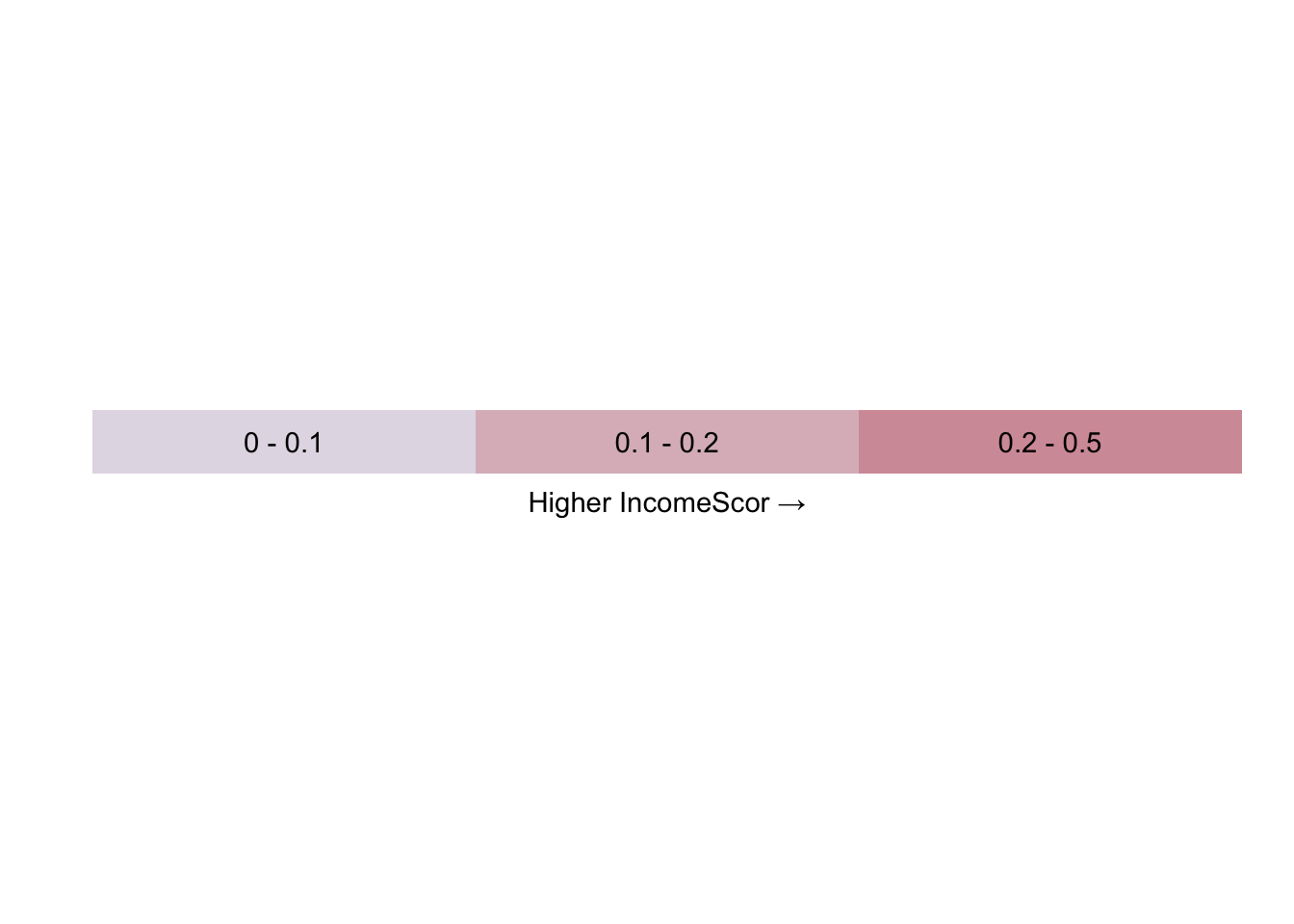
On the red scale we see the proportion of the neighbourhood population that are living on a low income. In the first group, the grey, we have between 0 and 10 per cent of the population with low income. In the next group, the pale red, we have between 10 and 20 per cent of the population on a low income. In the most extreme third we have between 20 and 50 per cent of the population on a low income.
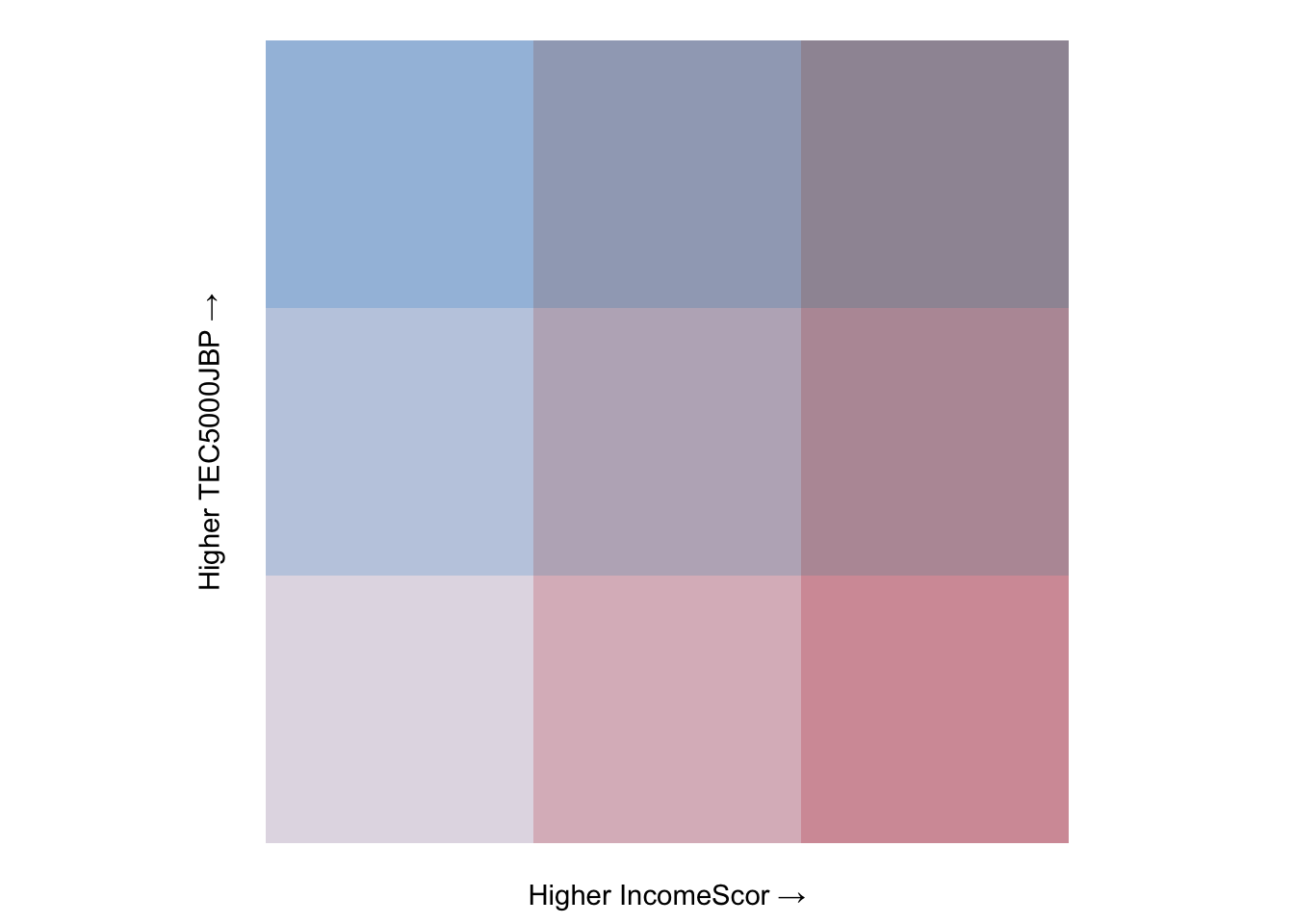
Now let’s look at the combinations of those values in our bivariate legend:

The legend above shows the nine possible colour combinations from our variable groups. We can take the numbers from above to figure out what the values of our two values would be within. For example, if we look at the top-right colour - which I’m going to call purple - we can infer that a purple neighbourhood has a travel time of between 29.4 and 64.8 minutes to their nearest employment centre with at least 5000 jobs and between 20 and 50 per cent of the population living on a low income. Or, in simpler terms, they have long travel times to jobs-rich employment centres and high levels of income deprivation.
Now if you go back and look at the map above you should be able to make some sense of the colours. If not, let’s look at an example.

This might, for example, open up questions as to whether it would be beneficial for Sheffield council to commission an additional bus route to some of the employment centres that have higher numbers of jobs. This was just one example chosen largely at random though. I’m interested to hear what people come up with and any interesting things they might find. You can click this link to go to the MOG and have a go.