Calum Webb
Sociologist.
The Child Welfare Inequalities App Version 2: Now in Open Beta
Click here to go directly to the CWIP App Version 2 Beta. For a brief overview, read on…
It’s been a year since I started working on the first version of the Child Welfare Inequalities Project App. The purpose of the app was to help social workers, policymakers, local government, activists - anyone, really - with the task of representing trends and patterns in, and pulling out basic statistics from, children’s services data. Anyone familiar with the statistical releases of the Department for Education will know that they are not always the most user-friendly files, they can be hard to combine, especially over time, and it can be hard for people with limited technical or statistical knowledge to extract the information they want from them. It is even harder to turn the data that’s extracted into something engaging, like a data visualisation, and this may take much more time than an activist or advocate might have. Quite frequently, the data is archived or requires some transformation, making comparisons over time difficult.
The CWIP App brings together around 16 different datasets at the local authority and neighbourhood level, with a range of features including being able to adjust for deprivation effects using the results from linear models calculated ‘on the fly’; the ability to compare multiple different graphs side-by-side; and the possibility to create literally hundreds of thousands of possible graphs. Moreover, in my opinion, these graphs look beautiful (while being informative as possible), and all have a consistent theme for non-jarring implementation into any organisations’ reports. All of this is done through a UI and hosted online, which means that nothing needs to be installed and no programming knowledge is required. The CWIP App is completely free, and has been funded by the University of Sheffield. All you need is an internet connection and a computer. You don’t even need to register for an account.
Version 1 of the CWIP App was my first attempt at building an R Shiny application and it was, to be blunt, very clear that it was my first time. It was well received, but there was consistent feedback about its limitations; many of which I didn’t have the technical skills to overcome. The code was full of redundancies (even more than this new one!), slow, and things like data storage and transformation were inefficient. In the space of a year, not only have the R community and Shiny resources grown, but my own experience and practice using it has, including when I developed the Mapping Overlaps Gadget (the features of which are replicated here). The offline and fully featured repository for version 1 included a 4.6GB data shapefile… The entirity of this version is around 0.75GB, while containing a huge number of additional variables, and is hosted publicly on Github, where anyone can download it.
This means that all of the code, all of the data, everything, can be examined, scrutinized, modified, extended, and used for whatever purpose anyone wants. You can use the app and its source code for education, practice, activism or management. And any graph you produce can simply be copy and pasted elsewhere, or for interactive plots there is a ‘download plot’ link.
With that introduction, let’s move onto the practical matter of what features are available…
The Data Dashboard allows you to quickly look at trends in variables from Section 251 returns, Children Looked After statistics, and the Children in Need Census…
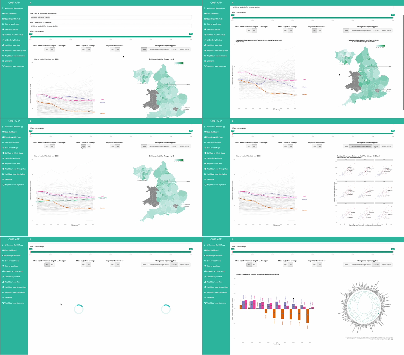
You can pick from two different ways of visualising trends: as a simple trend plot, or as a bar showing the proportion of the funding in a local authority against the average in England. You can also get a sense of how these differences look on a map, what the variables’ relationship with deprivation looks like, and which local authorities have the most similar values on average or trends across time, by using the accompanying plot feature.
Spending waffle charts are an interesting way to visualise how expenditure on children’s services has changed over time…
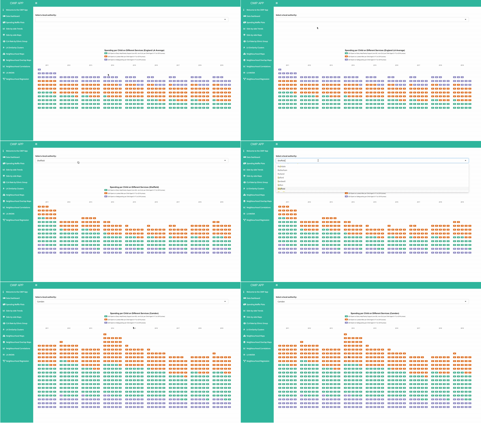
The waffle chart option allows you to visualise expenditure per child in any local authority over the last decade, as well as the English average. Spending is represented in £20 notes, and split into three categories: spending on children looked after, spending on safeguarding (including social work), and spending on Early Help/Family Support services. This visualisation is a good way to show not only how spending has increased or decreased over time, but how the proportions of spending have changed (for more detail on this, see our paper).
Side-by-side trend plots allow you to investigate how trends have been changing over the past decade…
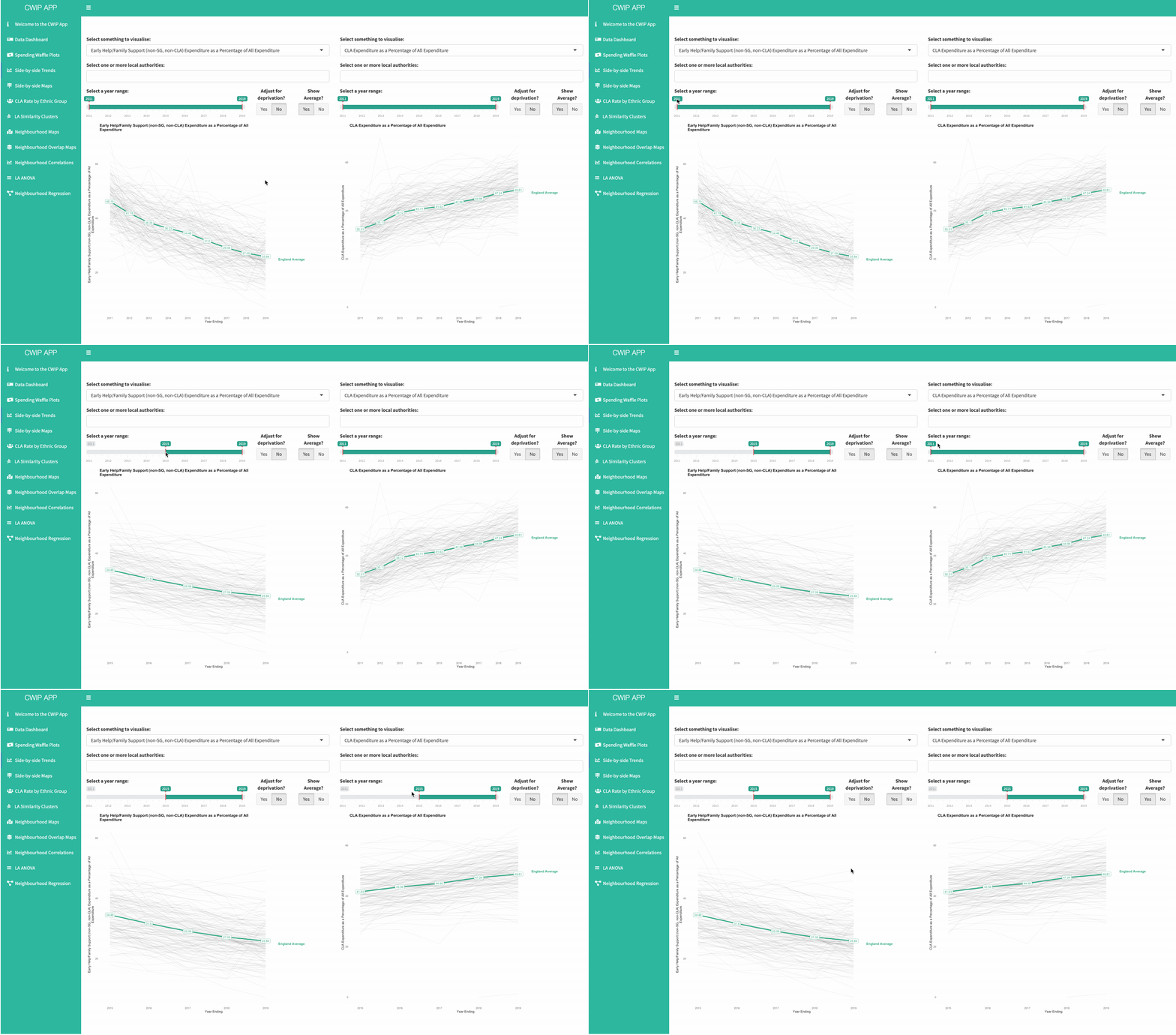
You can also use this feature to compare how a trend might look if all local authorities had the same underlying level of deprivation, compared to how it looks with the underlying structural inequalities we currently have. Often, when underlying need is equalised you can find interesting sites for comparison, and in our research we’ve found that as much as 75 per cent of the variation in LA rates of intervention can be explained by underlying differences in deprivation.
In a similar vein, you can compare two maps side by side…

You can compare distributions of the same or different variables across the country using side-by-side maps. This can be handy for comparing distributions and changes across two time periods (if you select two different time periods, the scale will be set to the same for both), or looking at how distribution would be different if all local authorities had the same underlying deprivation. For example, there are usually more children looked after in rural and southern local authorities once the effect of deprivation is removed. You can even change the map to a Danny Dorling style cartogram, so that each local authority is represented based on the size of their child population (rather than their landmass!)
The app also visualises how staggering ethnic inequalities are in rates of children in care…
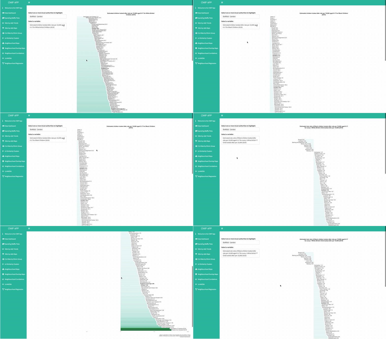
Several graphs can be produced which illustrate the scale of ethnic inequalities at the local authority level, showing not only the rates of intervention per estimated 10,000 of the ethnic population, but how those look in proportion to the intervention rates for the White British population.
The features from the MOG app also exist in the CWIP App version 2…


Using these, you can explore between 50 and 100 small area level variables within local authorities (at the children’s services administrative boundary). You can even overlay two variables to explore interesting intersections, for example, neighbourhoods with high levels of income deprivation but low levels of education, employment, and skills deprivation. These might be interesting sites to learn about how to improve services and support.
